There are three main pillars of designing a space: Color, Style, and Texture. Over the next few weeks, we are taking a deep dive into how to use the three pillars to maximize profit and equity in a home, as well as create a space where a person can feel comfortable; a home is supposed to be a sanctuary after all! This week we will be discussing color as a function of psychology, and how we can use it to our advantage in how we make spaces feel.
What is Color Psychology?
It’s no secret that color psychology is in all day to day marketing and advertising and how it definitely plays a part in emotions and decision making. There is strong evidence of colors affecting emotions in specific ways in a general sense. However, it is important to note that colors can be subjective, as in how a person can feel related to color is not synonymous across the board since experience shapes thought, and experiences differ among people. This is great knowledge when it comes to designing the layout of a home. But of course, without knowledge about what reactions the colors can bring, it cannot be applied.
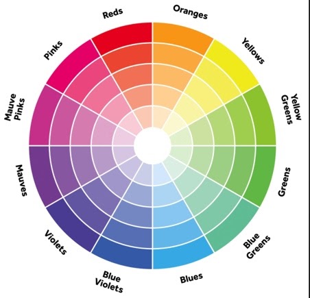
COLOR RESPONSES:
- Reds – synonymous with passion and intense emotion, whether love or anger or happiness, its intensity
- Oranges – Orange is associated with energy and enthusiasm while also being an attention-getter
- Yellow – Known to be cheerful and warm but can also be frustrating; yellow is the most eye-catching of all colors
- Green – green is actually one of the most versatile colors as it is a soothing and nature-based feeling
- Blue – calm, stable, peaceful
- White – clean, innocent, pure, but can also be sterile and bland
- Black – associated with dominance and deepness
- Purple – mysterious, luxurious, spiritual – the color of royalty as always
- Brown – Very “homey” color, associated with nature and wood it is a warm color
- Pink – Eye-catching, Exuberance, Positivity
How Can I Use Color Psychology?
When designing or remodeling a space, the main question you need to answer for each area is how do I want the future owner (or tenant) to feel in this room? Happy, calm, relaxed, or energized and positive…they are all things felt inside of a home. When it comes to application, use red for social areas invites passionate feelings and conversation. Blue can be great for bedrooms and bathrooms to allow a sense of calm. Green gives a soothing feeling for any space you want to feel relaxed in, while white can provide a bright and open feel to any space. It all comes down to the vision held and how you want people to feel in a space. Color Psychology affects daily life in almost every way, so using it to your advantage is crucial to creating the perfect space.
Coming Up:
Throughout this coming week stay tuned to our social media to learn more about color and how real estate professionals and homeowners alike can benefit from being mindful of color psychology.
As always if you have any questions, do not hesitate to reach out and we will happily assist you.
Have a great week!